Hello. My name is Jessica Bunge and I have a problem. And artwork problem that is. I seem to only be able to choose/commit to black-and-white wall art for my home but DESPERATELY want and need some colorful options that are also affordable. And look, if you love an all black and white look for your home there is no shame in that. I think we all remember Brady’s incredible breakfast nook that will forever be etched into my brain. But I DO want some color. I DO want the happy feeling colorful artwork makes me feel every time I step into my living. Can anyone relate?? Now, I do want to make it clear that I am not trying to become something I’m not. A person who wants to live in a beautiful colorful jewel boxed home. I still love a quieter look with a pop or two of color that makes my fairly neutral-toned room a bit more layered and exciting to me. Actually, has anyone seen the Idea of You?? Solenè’s Silverlake Craftsman was filled with art that was incredibly varied in mediums (she did own a gallery after all) but very few pieces from my memory were SUPER colorful (well, aside from “the piece”). But they also didn’t lack color. It was so just perfect and felt lived in. Amy Williams, the production designer, and the team now have my heart.
So to help all of us (yes, me included), I really tried to nail down the different categories of art that will both add some color to your walls and avoid any doubt /questions of “Oh, this is too much??” I feel very confident that if you choose art that works within any of these 10 categories then you are headed in the right direction. Of course, art is subjective and ultimately choosing it is a gut call of whether a piece is right for you and your home…but I love a guideline to help start that process. Hope you wanted to see a lot of pretty art today because baby you are about to. And remember I said affordable at the start so these are all under $150.
True Blue – Abstract
A perfect way to bring in some color that is both safe and exciting is to start with blue. It’s a neutral color in our books and comes in an almost infinite number of shades so only the sky’s the limit with this one. Then I personally think an abstract piece is a great style for anyone trying to grow their collection (as a beginner or someone more seasoned). They can easily work with almost any other style because of their inherent ambiguity.


Linocut Downpour | The Line | Waves
You could try blue line drawings! Any of these will give your space some visual movement (since the lines aren’t straight:)). Then depending on your home and comfort level, you can go with a slightly more muted blue or a bolder shade like the cobalt in the middle!


Patchwork Denim Tapestry | Depth Framed Wall Art
I also love a geometric piece:) I have many that are black and white but choosing a blue version would be such an easy swap (or addition!). With these two, in particular, they have an inherent visual depth that only adds to the awesome colors they already have. Both are soothing because of the symmetry but definitely NOT boring. Also, I know we are talking about color in the post but mixing up textures in your art pieces is always a good idea.


Helios | Cerulean
For a couple more abstract options I love, here are two more! Both are subtle but not boring. I am never tired of a cool face line drawing and that piece on the right has been a favorite of mine for a minute and comes in SO many different size options. Each of these has a lot of whites and creams with a perfect but minimal amount of blue for some punch.
True Blue – Objects
I would like to state now that some of these art pieces may fall into a couple of different categories from this post. But for the exercise of this post bear with me, k? So with that said, maybe you like art or want a piece that has a bit more of a “clear message” in terms of what the piece is about. If that’s the case then this category is for you. It’s the same idea as the first category in that choosing blue as the primary color in an art piece is an easy way to bring color into your home without it feeling like too bold of a choice.


So Many Ways | Pilgrim | Oktober
Things like shells and flowers are always solid choices because they are really versatile with other kinds of art. Nature usually is. I love that all of these aren’t 100% literal or “realistic” interpretations but you still obviously know what they are.


Vase Study in Blue | A Scrap of the Sky II
With these two I really love that both of them incorporate a physical thing (a vase and clouds) but also bring in cool abstract shapes. One, however, is dark and bold while the other is light and airy. Different vibes. Same concept. I would happily have either of these in my home.


Girl Floating in Pool | Set of San Mateo, Ca House | The Swan
This final bundle is a mixed bag but easily falls into this category. The girl floating is serene but that turquoise color has a fun brightness to it which is a great combo. The architectural drawings are another incredible and bold pop of color but the vintage patina and, of course, the fact that they are real drawings make it even cooler. Then for a more mid-tone option, I think this flying swan is just really pretty and simple. Makes a statement but doesn’t yell:)
Posters With A Limited Color Palette
I LOVE a cool old poster. I have a vintage Chagall one myself that has only blue and black writing on it (you can see it in the opening image:)) So I can safely say that this is a great type of art for the “nervous about too colorful of art” community. To keep things simple I would start with ones that have a more limited color palette or ones that are easy for your eye to understand. Let me show you.


Miro66 | Design Francais | Bauhaus Ausstellung Art Print
So I have a section about primary colors later in this post but I guess here’s a preview. These vintage-inspired posters are fun, graphic, and interesting yet because they aren’t filled with a ton of different colors, they are a great option for the “coloraverse”:)


ZOO LAMP | Modern Art Tea Towel | Playtime
But if you are feeling comfortable or want a little more variety with colors, the two more colorful posters are great. They are simple and easy for your eye to understand but a bit more playful. The piece in the middle is actually a tea towel that I am obsessed with and would look awesome framed. I know it’s not a poster but it’s poster adjacent. That light blue is also so pretty!
Black + Pop Of Color
“But Jess, I REALLY love black and white art! What should I do?” Look, there is no shame in the black-and-white art game. But maybe you can find one or two with the spin to it. A pop of color if you will. If this is music to your ears then let me show you what I found.


We Can’t Dance the Same Way | Rainbow Handstand
The art on the left is by an artist I love so much, João Incerti. His work is normally bursting with color and you should see his murals. Lucky for us, he sells really affordable prints and for the black and white art lovers, this one is perfect for you. The pops of color are small but perfect and this is a great find. Then I just loved the photo on the right. The rise of artists taking photos and adding to them is something I am a big fan of and this one is no different. A hunky guy in a black-and-white photo + a rainbow? Sign me up!


August in Rotterdam | The Lounge
These are a little less “black and white” but still center them as the main colors. I just really like how the color palettes are simple yet fun and have awesome abstract shapes. The one on the left is slightly more muted which I really respond to.
Happy Warm Tones
Were you worried it was going to be all blue art? Ha, I wouldn’t do that to you. I love happy warm tones too! The key here is also a more limited color palette where almost all of the colors are of similar intensity. Let me show you…


Stretch 1 | Calm Woman Portrait | Don’t Want To Go To Work Art
I know what you’re thinking, “Jess, these are pretty but kinda bold for the person who’s nervous about bold art, no?” And yes, they are less neutral than what I’ve shown you so far but if you want to dabble in the pink/organey world these are perfect. Take the first one on the left. Dare I say the most muted of the bunch but all of the colors have the same color saturation level. Your eye still feels rested. The middle beauty (or “Calm Woman”) also sports about four colors that all share a similar/pretty high color saturation level. The same goes for our lack-luster worker on the right;) but also…
HOP TIP! For bold and colorful art you can always choose a smaller size. That way you can still dabble while still having your main art pieces be more neutral-toned.


Cotton Candy Leftovers | Marin Dawn
These two are more in the pastel world but I am instantly at ease when I look at them. The transitions between the colors are also gentle. A HUGE part of choosing the right art is making sure you love how you feel when you look at it.


Stacked Shapes in Color | Cottoncandy And Creamsicles
These two are a little wilder but also don’t overwhelm the eye (or at least not mine, ha). Simple shapes are easy for our eyes to understand so I think you can have a little more fun with color when that’s the case.
Go Green
Another color people!! Green is a top three favorite EHD color because it’s another SUPER versatile option that’s easy to use as a neutral. I mean it evokes natural, calmness, and MONEY! Juuuust kidding about that last one;) But truly, green is a no-brainer if you are just starting on your colorful art journey.


Woven Pasture I It’s A Blue Day | Shallow Waters
And since green and nature are so synonymous let’s start there…except a little abstract. The piece on the far left is going to be the “safest” option in terms of colors but it’s anything but boring. The shapes make this simple landscape look so cool! But it’s pretty tonal which evokes a calmness. Then to add in some blues and teals, the middle piece is a bit busier with more colors but because it’s all balanced so well, it just looks fun and interesting. Then the last one on the right is kinda of somewhere in between the other two – a landscape with colors that are more varied and soft but also abstract and whimsical.


Marmo | Three White Horses
Now it’s time to get a little bright with the greens! These almost have “still life” qualities to them. I love that they have a ton of texture and large sections of color that make them feel less busy. I don’t think you can miss with these.


Taverna | Skovlyst
Then the last two of the green category really focuses on using just one tone of green. Simplicity is your best friend if you are a little overwhelmed by choosing colorful art. Both of these have so much movement and have a lot of personality but I know can play well with other art pieces if you want them to.
Play With Primary Colors
Primary colors are such a fun and often playful place to start when choosing art. But with this category and my picks, I want to expand your definition of a primary color palette. Think of the classic three as a jumping-off point and let’s get creative with it:)


Connected | Alf
See the piece on the left has all three colors but then clearly expanded beyond that with mostly neutral tones. It’s simple and playful and I think would look so good with other art that’s more neutral as the “colorful” piece or as a fun visual break in a room filled with boldly colored art. Sort of like this one on the right. No yellow can be found but the red is such a fun and in a consistent tone while the blue is used in a handful of different shades. Everything is nicely balanced on the piece so it feels really good to the eye.


Inner Geometries 06 | ‘Cheers My Love I’ | Fussy Face
But these three are where you really have to look at the primary colors as an interpretation. They each have at least two of the colors but they vary in all different shades. Again, interpretation! But those colors are the anchors and make for really cool and dynamic pieces.
Go Moody
I’m sure you were waiting for this one. Going darker with colors is a really easy way to use color through art but not risk choosing anything too bright and bold (there are always expectations:)) I would say to be careful about choosing too many “moody” pieces unless you want your space to feel very moody. But one or two can help not only add color but really ground a room.


Rhode Island | Eleanor | Horse Stories
Of course vintage or vintage-inspired pieces are an easy go-to! I love all of these pieces for different reasons – Tones, mood, texture. While these are affordable from the internet, we always recommend going to thrift shops and/or flea markets if you want that authentic patina.


Chambray | Venn
Same goes for abstracts but those can be harder to find in person. But moving away from vintage for a sec, how great are these two!? I have loved that dark blue one for a while now and want to find a place for it in my apartment. I’m a girl who loves shapes and the color blue so this one hits real good. But the one on the right is so pretty and the choices in colors make it so versatile. You can really fit it with almost any other art piece that is either totally neutral or shares even just one of those colors.
Muted Photographs
Photographs are something I am also trying to use more of in my apartment (both of family and random cool things!) Plus photos are just so easy to tweak and manipulate digitally if you want to use your own. But if you want to buy an artist’s beautiful work then you are also in luck because the options below are good and plentiful, and here’s how to pick them with color.


Desert Mirage | Sunny Field
Go for muted tones in nature! I love these two pieces where light yellow is the focus. They are joyful and bright but don’t overwhelm.


Matinee | Face Place
Or you could choose something that’s meaningful to you (like a theatre or photo booth) and go for a more saturated color palette. I love how the theatre shot has a bold color in over half of the photo but with the vintage desaturation, it feels softer. But maybe you decide to go a little bolder like in the photobooth shot. It also has a slight softness to the photo that helps to make it feel a little less visually intense but still so so vibrant. I know the photo booth is definitely a bolder choice:)
Pop Of Red
Last but not least we have the famous pop of red! Did y’all see the “unexpected red theory” on social media earlier this year? Here’s the reel Mal put together because Em’s been doing it for a long time;) But it’s a trick that almost always hits so why not use it in your artwork? Come see how…


Tern No. 8 | Y’all Poster | Illusionary Boat Ride
These first three are bold and graphic in pattern but don’t have a ton of color going on until “BAM!” you get a pop of red. It’s so fun, draws your eye in, and will instantly make your home look cooler and more “unexpected.”


Painted Cup | Rockpool Dance
These two have more colors but are more muted, only to be fully awakened with that hit of red. I think this is just a great tip for all things decor (not just art). A pop of red makes every room cooler. It’s the law. Also how special is that dancing piece? I love it so much.
Are we cured?? Are we going to put more colorful art in our homes to make them more dynamic? But at super reasonable prices, of course:) I hope this was really helpful. I tried hard to find special art that were pieces you all could really see in your homes. We all deserve amazing art.
Love you, mean it.
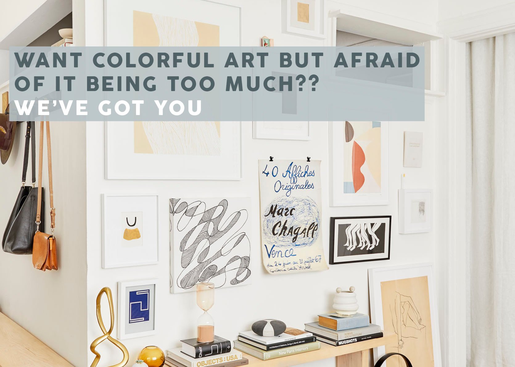
Opening Image Credits: Design by Jess Bunge | Photo by Sara Ligorria-Tramp | From: Jess’ Studio Apartment Living Room Reveal