Often when you look at pictures of interiors the design looks so effortless, almost as if someone has waved a magic wand and everything has just fallen into place. Anyone who has carried out a makeover by hand will know this is far from the truth (the sheer labour of love that went into our cottage bedroom this winter remains etched in my mind!). Halfway through you might wonder why on earth you’ve taken the project on, and the result might not always be perfect (speaking for myself here!) but the connection you feel with your home afterwards makes the work feel completely worthwhile!
Artist Katrine Brandt and her husband bought an old brick house (known simple as No.14) in Denmark and took on the task of updating it by hand, with sustainability at the forefront of their minds. Starting many of the rooms again from scratch, the pair have been busy installing a kitchen, transforming a laundry room into a light-filled workspace and giving the bathrooms a fresh update. Here are some before and after pictures so you can witness the renovation first hand!
Kitchen – before
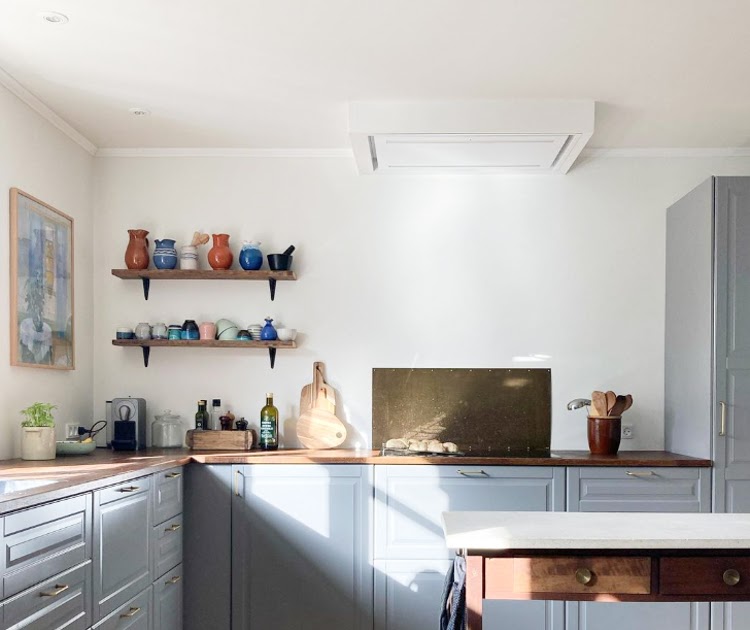
The IKEA kitchen was in need of a fresh update. Katrine installed new units in blue (a theme you’ll see throughout the house) and sanded down the wood floor in order to remove the varnish which had turned yellow with time. The ceiling has also been plastered and painted – with spotlights added.
Kitchen – after
Sitting room – shelving before
In my experience, Danes love to create wall-to-wall bookshelves around a doorway – which is a great way to create space for plenty of books! Katrine and her husband built these shelves and cupboards by hand. You can find more details – including step-by-step pictures and measurements in this instagram post.
Sitting room shelving – after
The result is simply beautiful! It’s also provided plenty of coveted open and closed storage. Note the ceiling lamp from one of my favourite Danish brands – Le Klint!
The curtains are simple ones from IKEA, and the chair was found in a friends loft and given a new lease of life with a set of new cushions.
A ‘kakelugn’ (tiled masonry oven) is in full working order and perfect for colder days!
The art on the wall is by Katrine and can be purchased via her online shop Made By Brandt. Note how the shelves have been painted the same colour as the wall for a smart, seamless affect.
Utility room – before
I know a thing about making over laundry rooms – except this one is different. Recognising the beauty of the room and how much natural light it has, Katrine and her husband decided to transform the space into a light-filled workspace.
Utility room – after
A simple, DIY make-over, the pipes are still in place under the desk and a built-in desk has been added over the top. Dark red drawers and a blue chair add a touch of colour to the space.
Downstairs toilet – before
Bathroom make-overs can be eye-wateringly expensive and tiling etc requires a lot of skill. But sometimes a simple refresh is all that’s needed (just as we did with our downstairs loo) – a lick of bathroom-friendly paint, a new cabinet and sink and a shelf was just what this ‘powder room’ needed, and no doubt saved gazillions of Danish Crowns in the process!
Downstairs toilet – after
I love the mood lamp in the corner. If you look closely, you’ll spot various forms of ambient lighting throughout the entire home – all of which help to create the cosy ‘hyggelig’ feel the Danes are so good at.
Bathroom – before
The bathroom featured a separate bath and shower before being reconfigured. Opting for just a shower has made it so much more spacious and touches of blue ensure the room remains in keeping with the look and feel of the rest of the house.
Bathroom – after
Such a lovely transformation – I love the subtle pastel shades throughout, adding a hint of colour and interest without feeling overbearing. There are also some lovely details throughout – including lamps, ceramics and art.
The house is still very much a work in progress. If you’d like to follow their decorating journey, check out @nr.14a.
Is there anything that stood out to you about Katrine’s home?
If you love a before and after as much as I do, check out:
Stor kram!
Niki
Photography by Katrine Brandt, shared with kind permission.


