[ad_1]
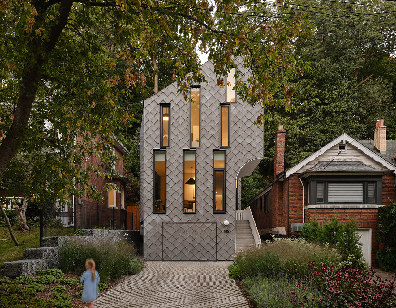
In the east end of Toronto, a new architectural project seamlessly blends innovative design with the natural contours of its landscape. The four-bedroom, single-family Neville Park residence, conceived by the Canadian studio Reigo & Bauer, is set within a unique gully that features steep slopes on both the front and rear of the property. The architects have transformed this challenging site into a striking and cohesive structure that stands out while harmonizing with its surroundings.
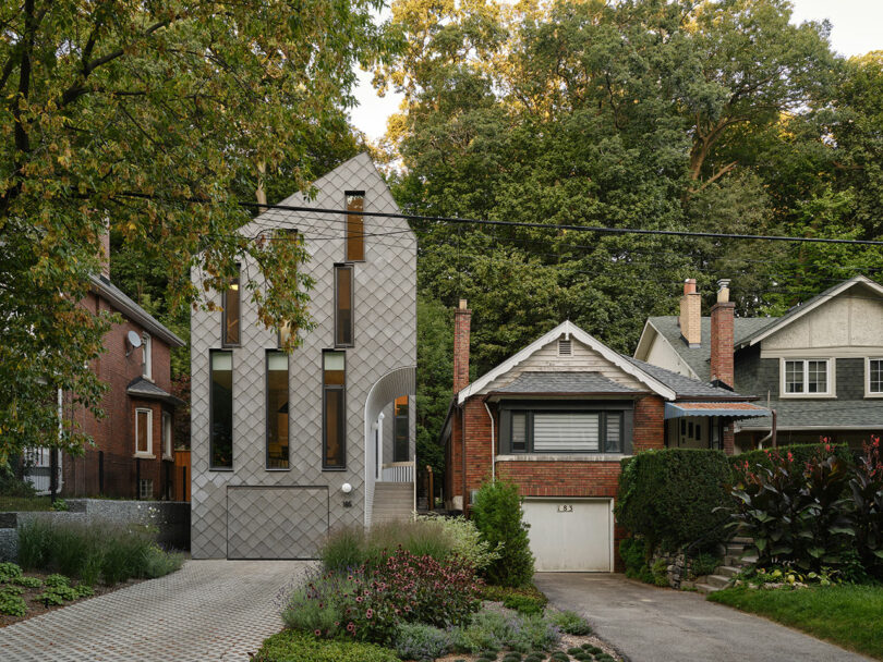
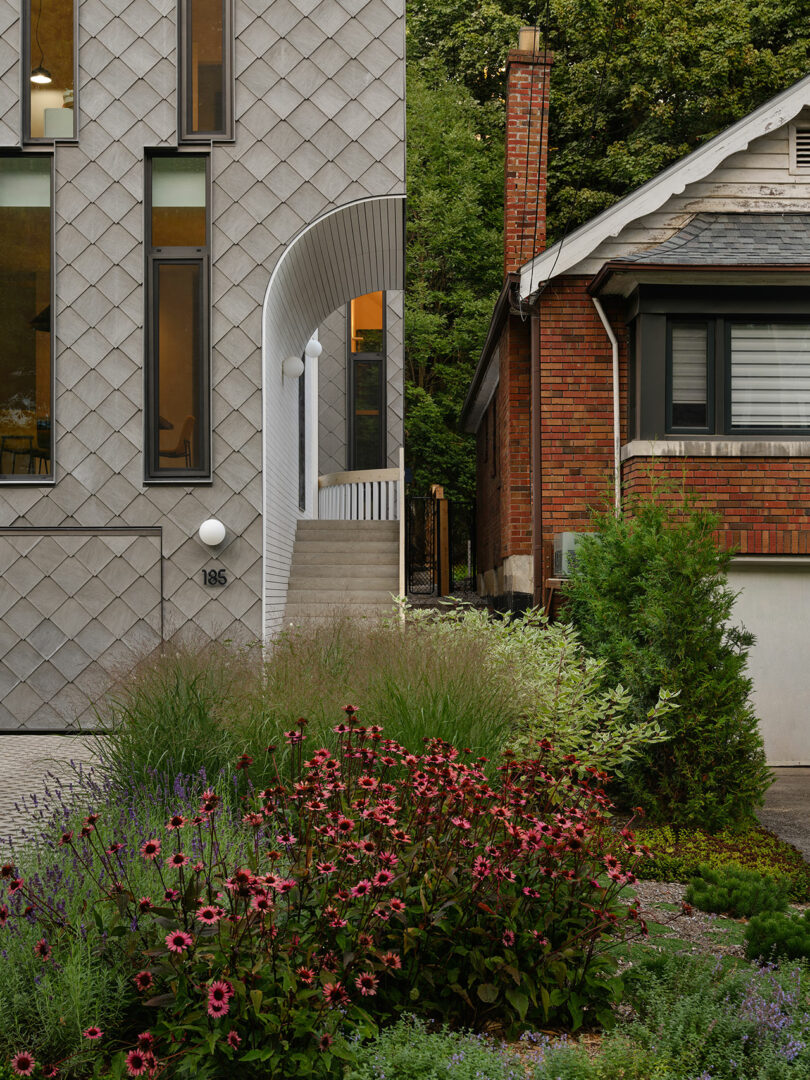
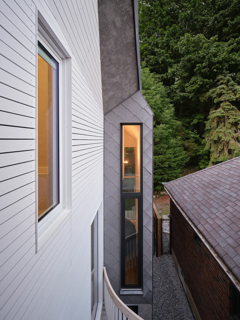
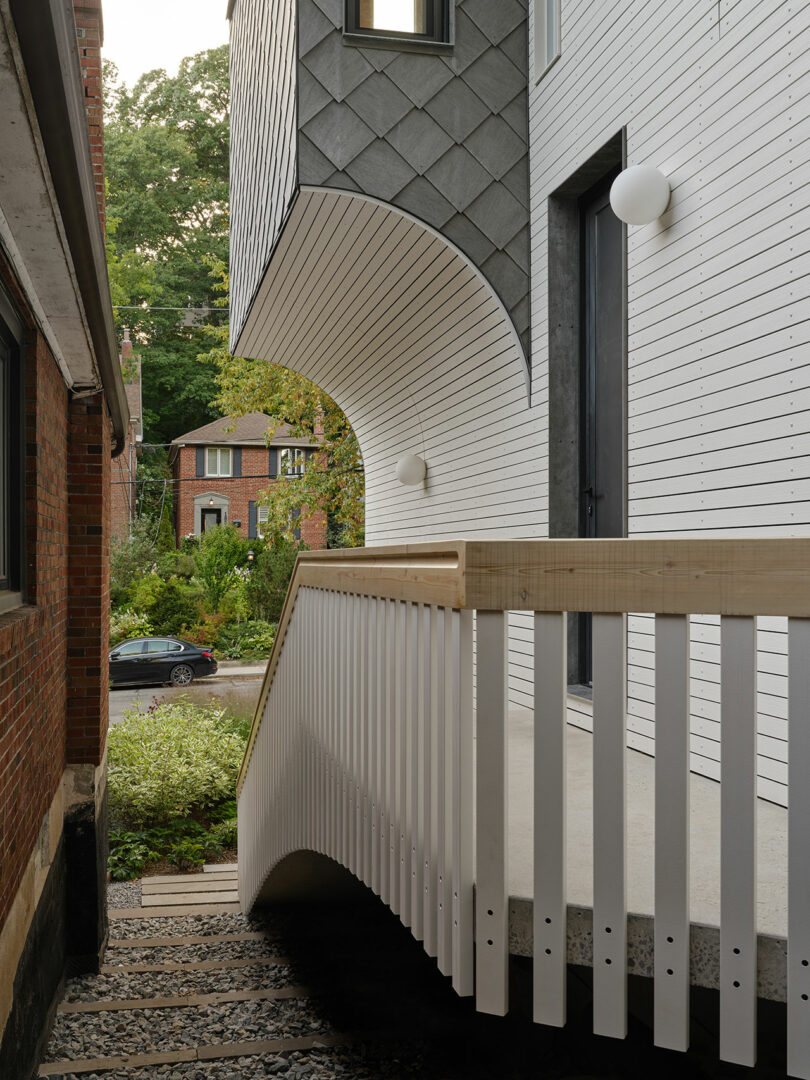
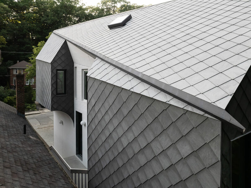
The home’s tall, vertical structure is a deliberate nod to the towering trees that line the hillside, creating a visual dialogue between the built environment and the natural landscape. The exterior is clad in gray, diamond-shaped tiles that wrap the entire building, including the garage and roof, creating a unified and sculptural volume. To maximize light and privacy, the design features strategic setbacks and angular cuts in the façade, particularly on the south side. This allows for additional windows and an entryway that is both practical and visually distinct.
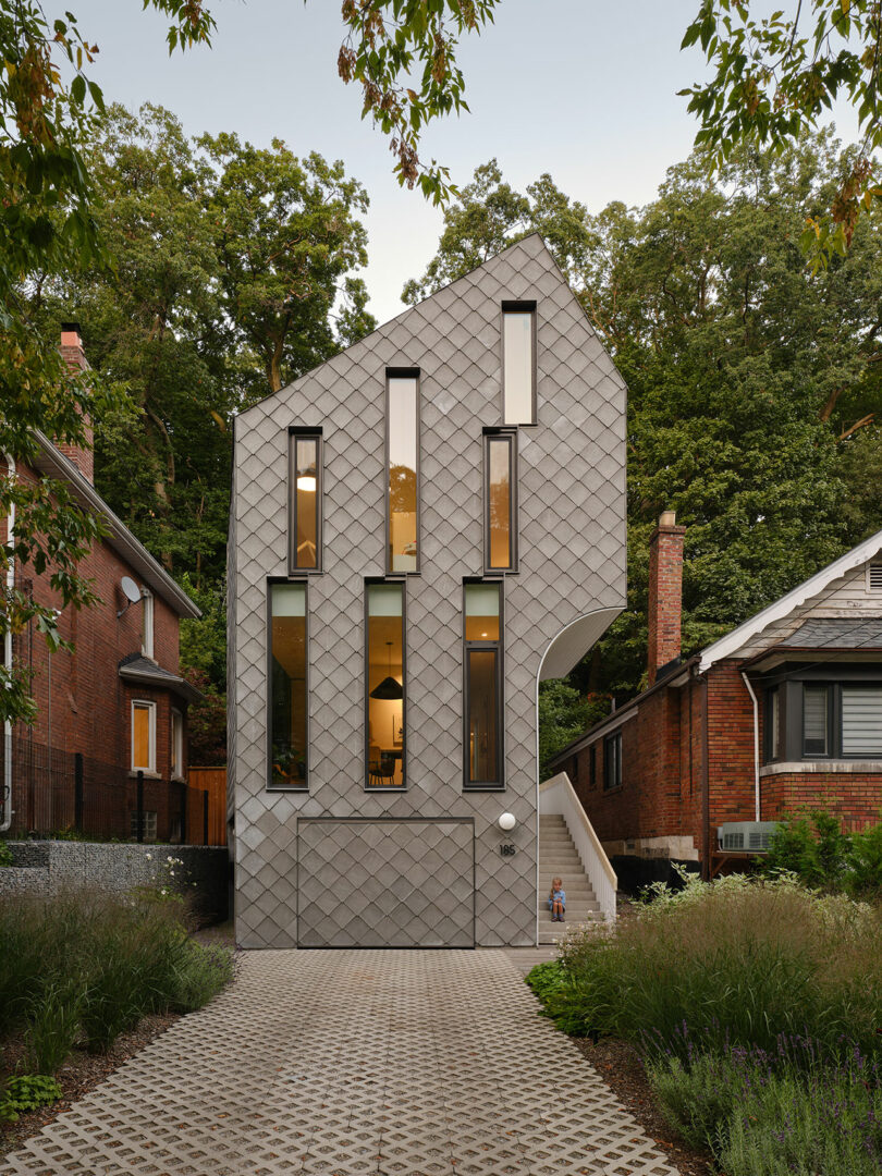
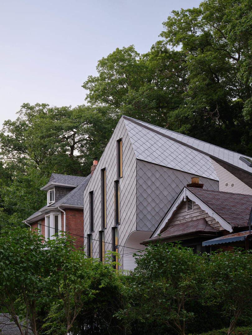
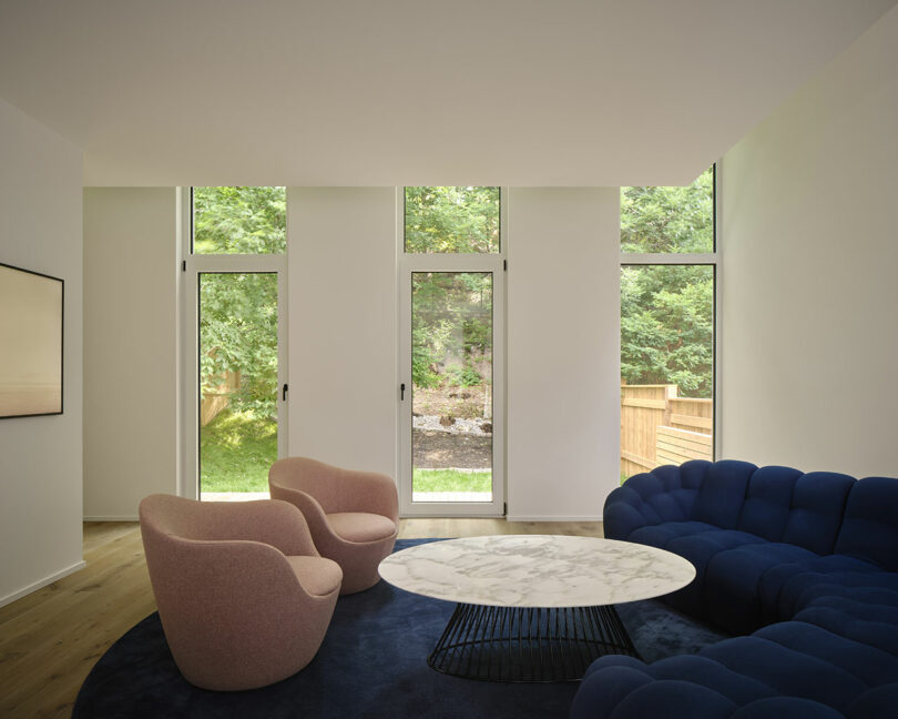
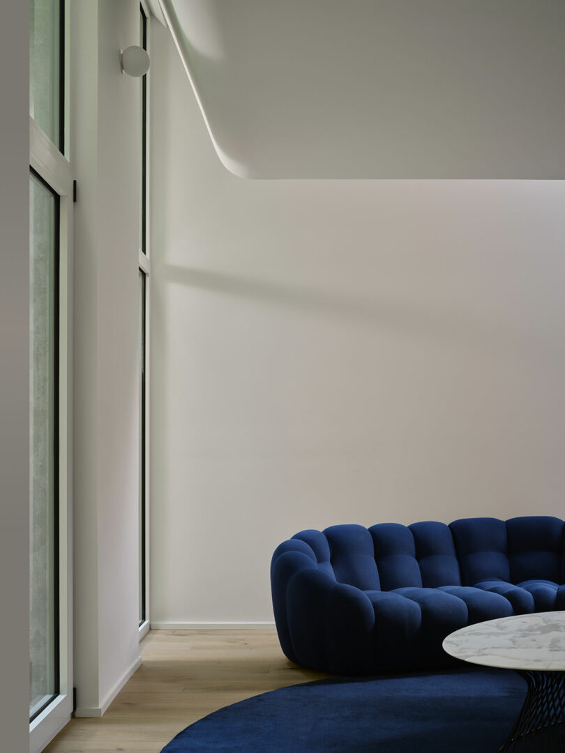
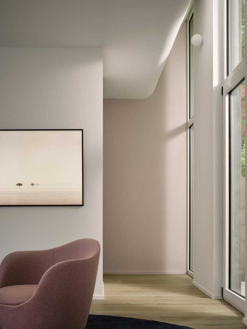
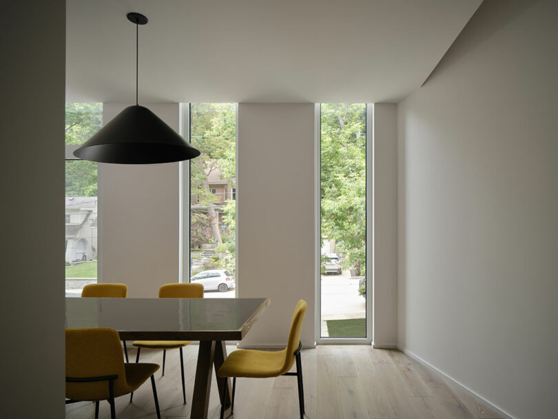
The use of geometric forms continues on the roof, where triangular facets connect the offset pitch peaks, adding a dynamic element to the structure. Narrow, staggered windows punctuate both the front and back of the home, allowing ample natural light to flood the interior while maintaining a sense of privacy. The dining room, positioned at the front, features windows that extend above the ceiling line, further emphasizing the verticality of the design. In the rear, the living room’s ceiling curves upward, following the line of the elongated windows and drawing the eye toward the wooded hill behind the house.
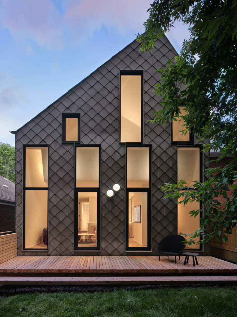
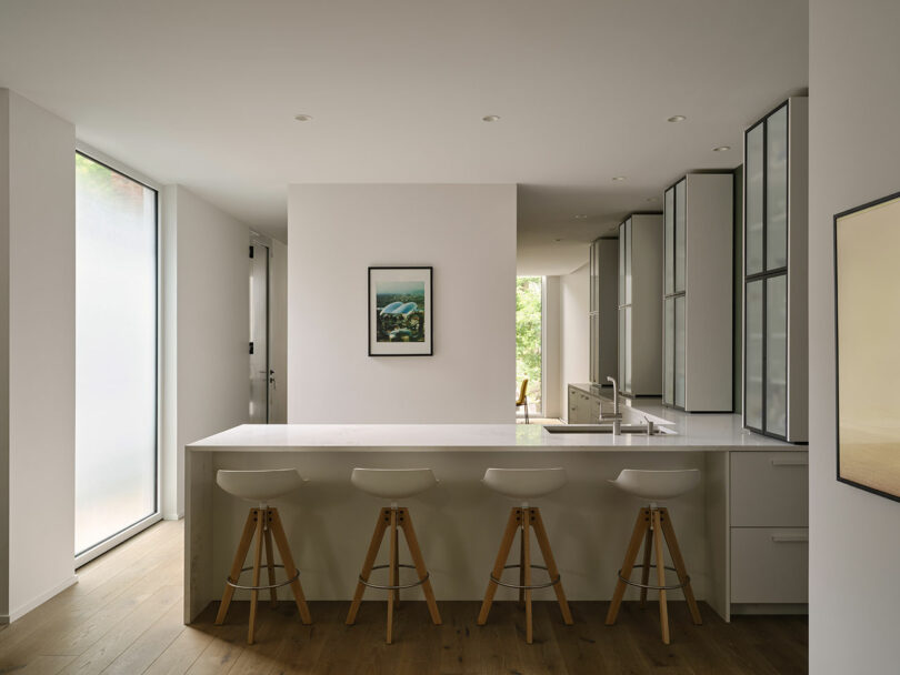
Inside, the layout is both functional and fluid, with a central block on the entry level housing essential amenities like a powder room, pantry, and storage. This core element helps to organize the surrounding spaces, which flow effortlessly from one area to the next without the need for doors. The kitchen, situated between the dining and living rooms, is outfitted with minimalist white cabinetry, offering a clean and understated aesthetic.
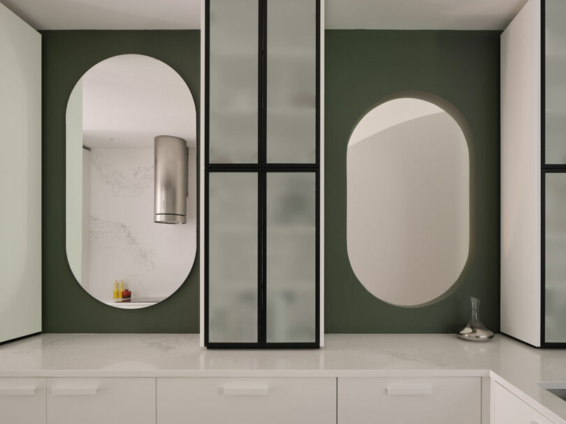
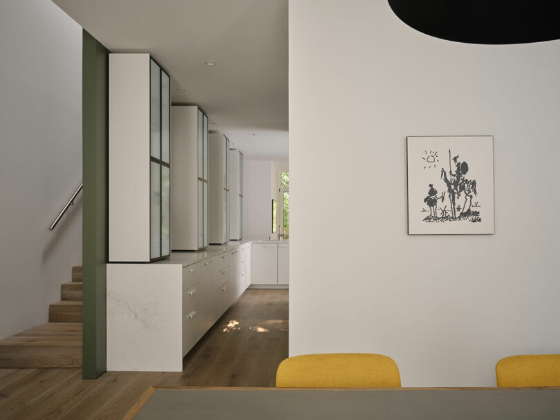
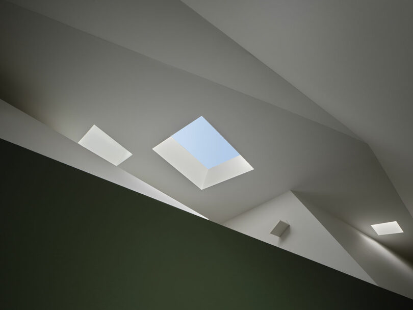
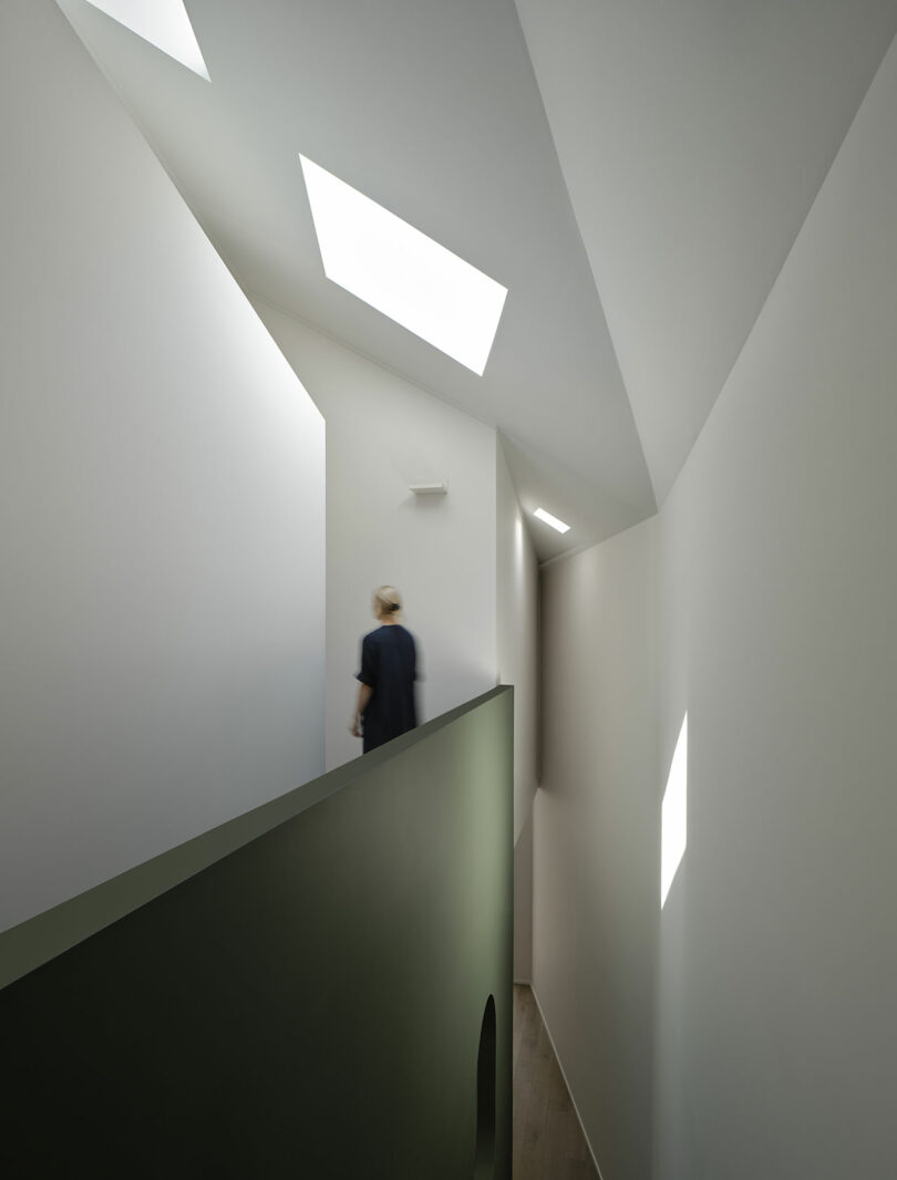
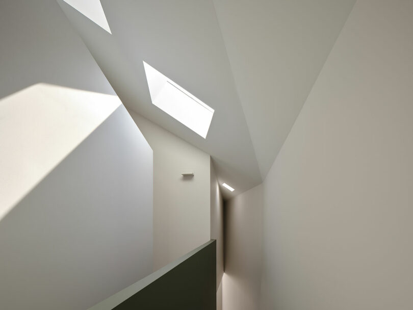
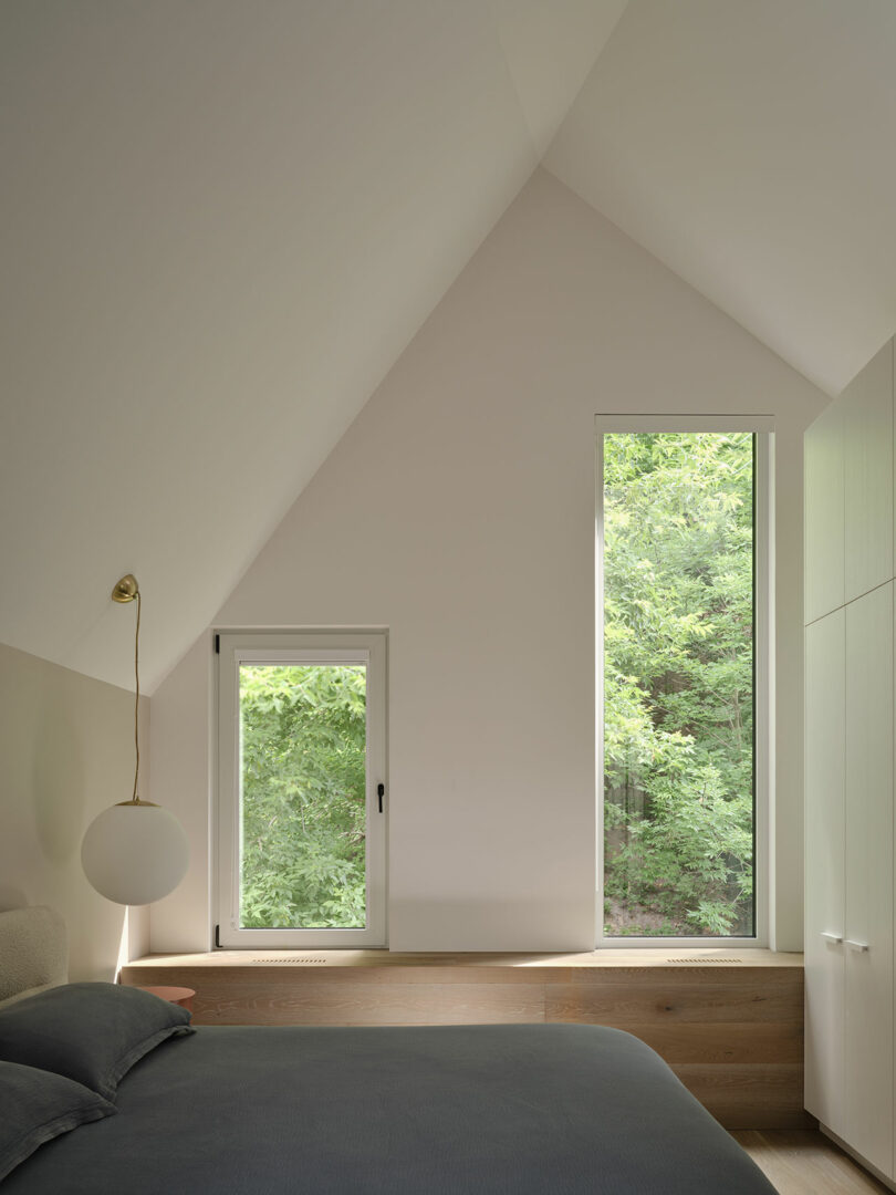
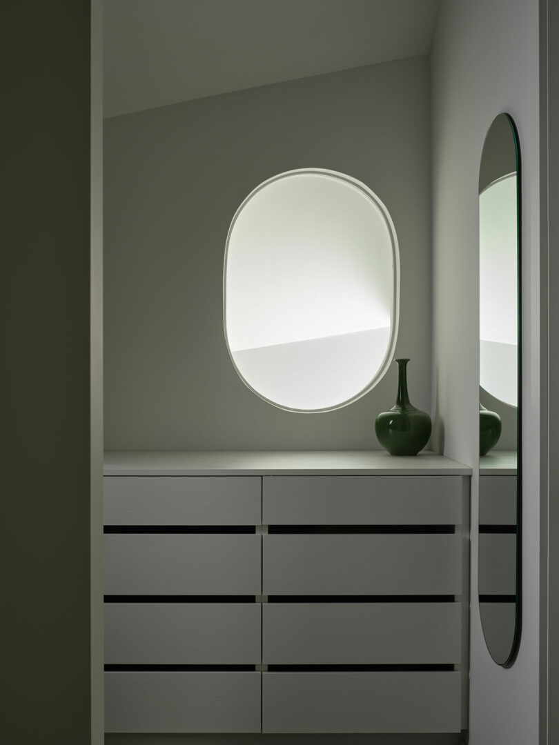
A muted green wall, positioned between the kitchen and staircases, features playful pill-shaped cutouts that allow light and sightlines to connect the upper and lower levels. This wall continues to the upper floor, where it becomes a solid bannister for the skylit corridor that links the bedrooms. The primary suite is located at the rear, offering a serene retreat with views of the natural surroundings. Another bedroom is found in the basement, tucked behind the garage, providing extra privacy and space.
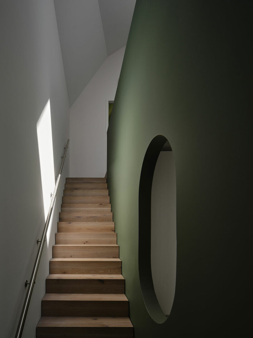
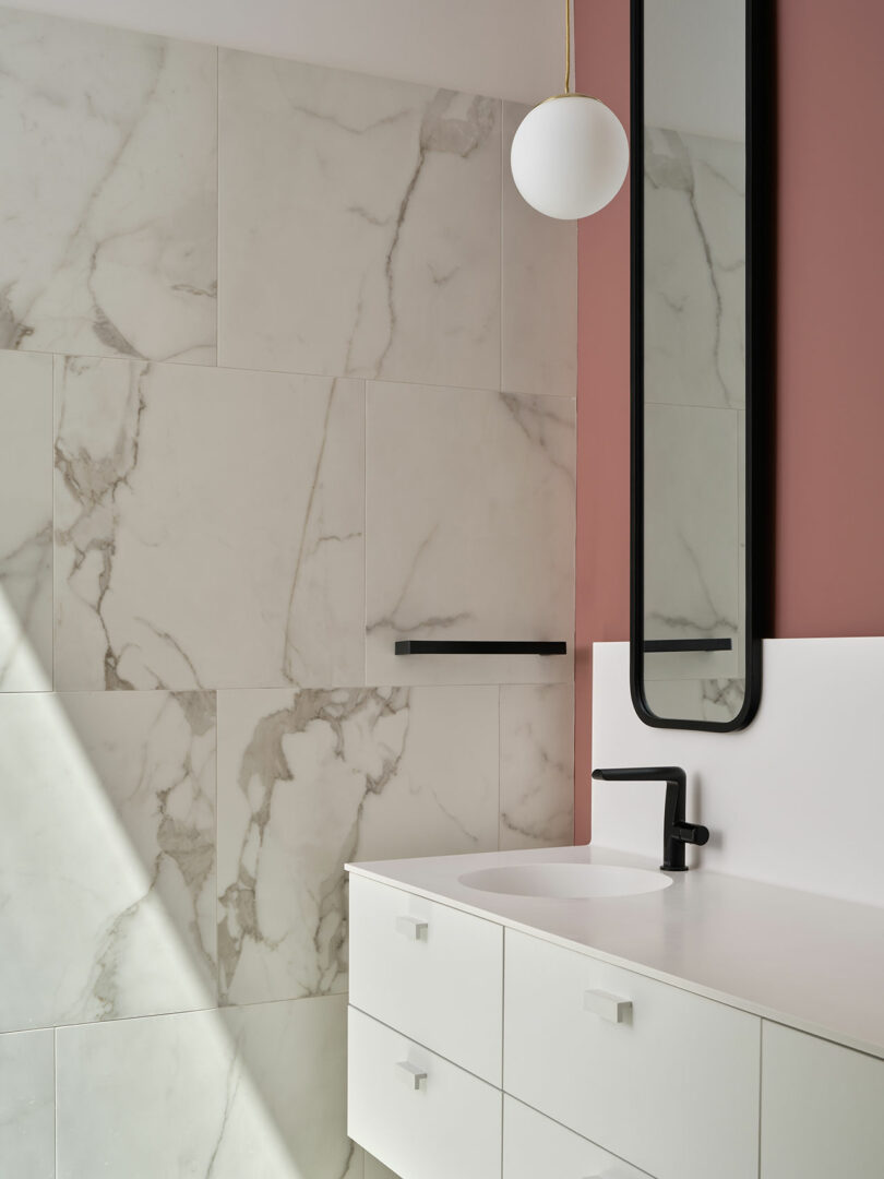
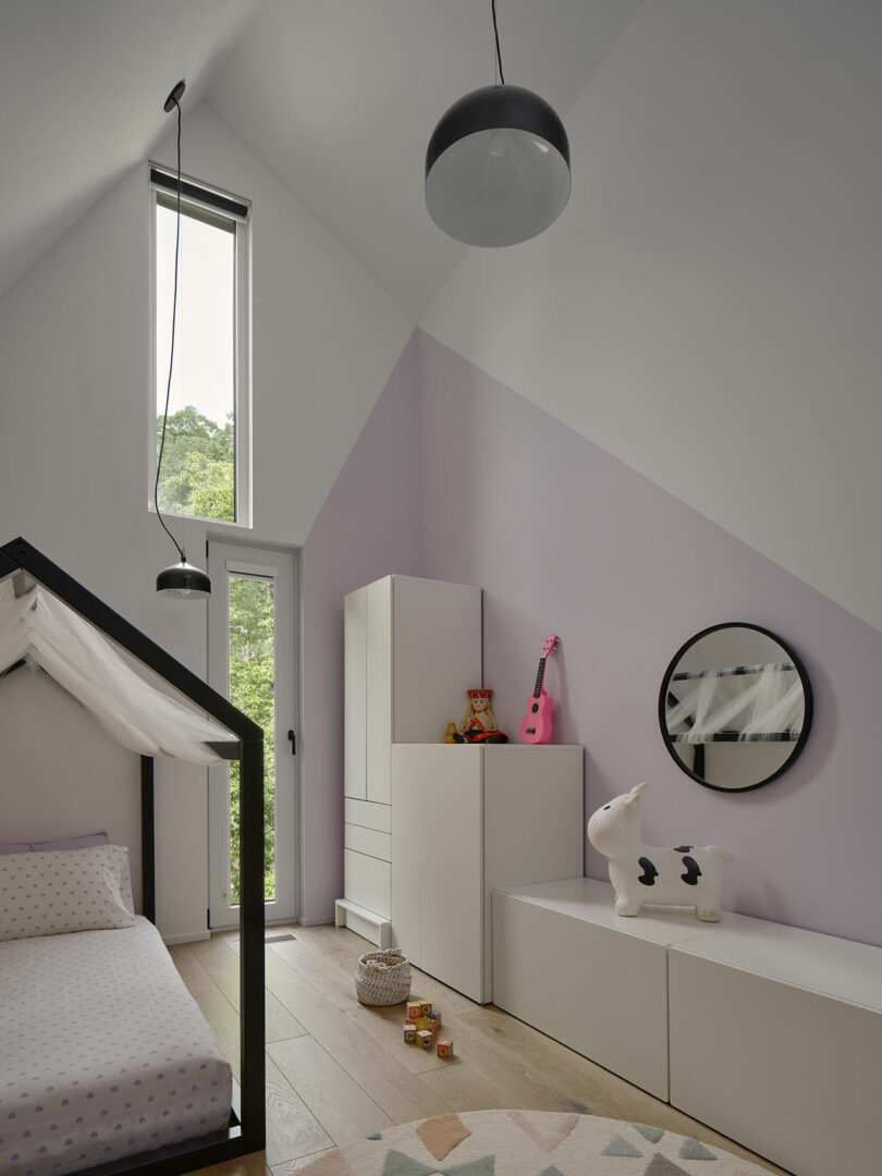
The home’s interior palette is predominantly neutral, with light oak floors and white walls serving as a backdrop for the homeowners’ personal touches. However, moments of color are introduced through select vertical surfaces, such as a pale dusty pink wall in the living room and a terracotta-hued bathroom in the primary suite. Spherical light fixtures, used both inside and out, create a cohesive design language that ties the entire project together.
For more information on Reigo & Bauer, visit reigoandbauer.com.
Photography by Doublespace Photography, courtesy of v2com.

Caroline Williamson is Editor-in-Chief of Design Milk. She has a BFA in photography from SCAD and can usually be found searching for vintage wares, doing New York Times crossword puzzles in pen, or reworking playlists on Spotify.
[ad_2]