[ad_1]
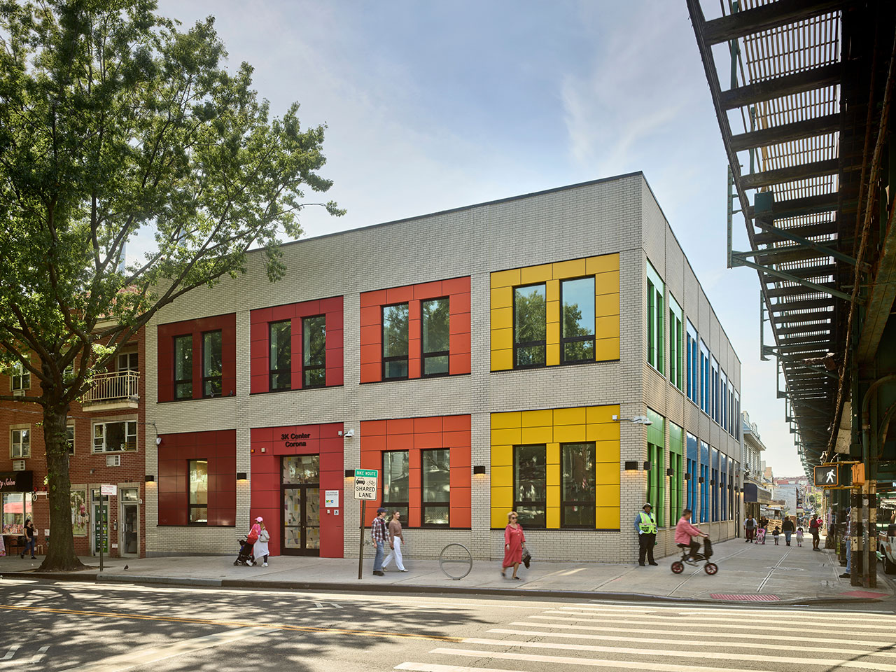
Circular transformed a partially constructed commercial building into a vibrant public preschool, part of a city initiative to provide modern school facilities where they are most needed. The Corona 3K Center is located in one of the fastest-growing yet under-served areas in Corona, a neighborhood in the Queens borough of New York City. The area boasts a large population of newly arrived families with young children, where quality childcare is in high demand and suitable options are all-too limited.

The Roosevelt Avenue corner site is on a busy commercial corridor fronted by an elevated subway train and vehicular traffic, which presented several challenges for the architects. They were tasked with an overhaul of the existing structure, which was originally supposed to include a ground-floor retail space and an office on the upper level. “This building was actively under construction,” says Jordan Parnass, principal at Circular. “A big part of our responsibility was to quickly identify how we could change what the landlord had planned to do and turn it into a school.”

A series of bright panels enlivens the re-designed facade, chosen to represent a progression along the color spectrum – and provide some respite from the surrounding gray streetscape. The same shades are repeated as stripes in the playroom, and again as accents in the individual classrooms.


The footprint was already built to the lot line and couldn’t be changed, so an interior layout was devised that allows for seven classrooms over two floors. By incorporating Passive House principles, the Circular team achieved considerable enhancements to sustainability. A mechanical system, for example, preconditions, dehumidifies, and filters fresh air. Triple-pane windows mitigate noise, while the wall and roof insulation boosts thermal performance. Every element ensures that children are comfortable in the education setting year-round.


Spaces within meet a range of stringent health, durability. and functionality requirements, but the interiors are still inviting, with color playing a central role. Cheery primary tints are a staple in learning environments, but they can be overstimulating. At the center, sophisticated, low-saturation neutrals are a base. Custom geometric wall tiles are paired with natural wood to create warmth. A continuous trip of tackboards serves as linear galleries. Showcasing student artwork in the hallways, they are placed at an eye level perfect for toddlers and their parents.


Each classroom is identifiable by signature hues like red, orange, or yellow, found on doors, frames, accent floor tiles, and millwork. This color coding is ideal for preliterate youngsters, because it allows them to easily find a particular spot without signage or symbols. “This is a space for education, and it is appropriate for children and adults,” Parnass notes. “There’s an underlying sense of playfulness throughout, and it’s that essence that we wanted to celebrate.”


Photography by Frank Oudeman.

Anna Zappia is a New York City-based writer and editor with a passion for textiles, and she can often be found at a fashion exhibit or shopping for more books. Anna writes the Friday Five column, as well as commercial content.
[ad_2]