
[ad_1]
When the opportunity arose to design the new GYOPO office, it was an obvious choice for interior designer Grace Lee-Lim. GYOPO is a collective of diasporic Korean creatives based in Los Angeles, California, dedicated to generating and sharing various programs to support their community. As a Korean-American herself, Lee-Lim felt a deep connection to the project, which presented a significant challenge: a rundown, dilapidated office floor in Koreatown.
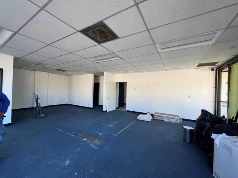
Before
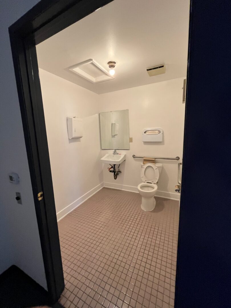
Before
The existing space featured a stained navy blue carpet with matching doors and trim – a color that’s meant to evoke calmness but instead did the opposite. Given that the office is currently leased, Lee-Lim aimed to implement budget-conscious, impactful changes without making any structural alterations.
To get the full details of this office transformation, we chat with Lee-Lim on how she was able to find renter-friendly solutions for this small space, her approach to honoring Korea’s rich heritage, and what she’s most excited about in the coming months.
You often hear about renter hacks that elevate residential areas, but rarely for commercial locations. In designing this space, what renter-friendly solutions or decisions did you implement?
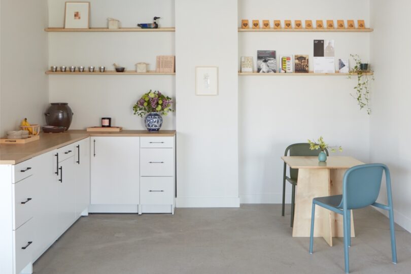
We thought it’d be best to work within the framework presented, so the first major task was to pull out the blue carpet and vinyl baseboards to reveal the concrete beneath, which automatically brought the space from outdated to current. The next biggest change came through paint, which we did for all of the ceilings and walls throughout the headquarters. We painted the ceiling in a soft, warm beige that envelops the room, and since it’s in a darker shade than the walls it creates a coziness that softens the concrete floors. We kept all the communal walls a neutral off white as the programs that are held often involve interchanging artworks, so the walls need to act as a canvas. We saw an opportunity to shift the energy when entering the hallway, so we color-blocked it in a rich verdant green that leads to the restroom, which is wrapped in a vibrant ochre yellow for a fun contrast.
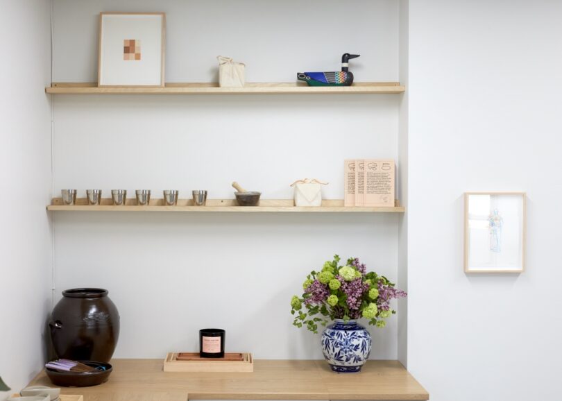
We also installed new terrazzo tiles in the restroom that coordinate with the ochre paint and replaced all the fixtures to bring it up to date as well. For the kitchenette, we installed L-shaped cabinets from Ikea and had the shelves above custom built to size in the niches.
I imagine that culture and heritage were at the forefront of your mind when designing this office. How did you pay homage to these elements?
GYOPO is a collective of diasporic Korean cultural producers and arts professionals generating and sharing progressive, critical, intersectional and intergenerational discourses, community alliances, and free educational programs. For GYOPO, the community is the culture, so paying homage means designing an environment that transforms with the usage, comfort, and needs of the people who come through its doors.
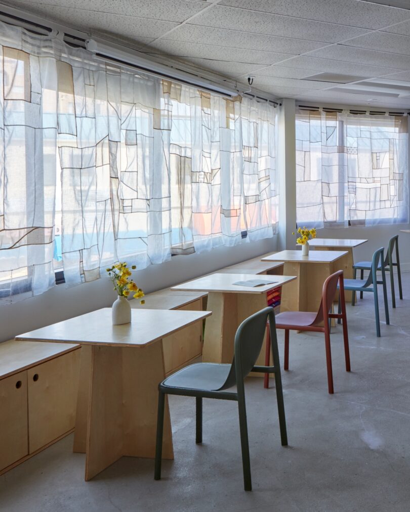
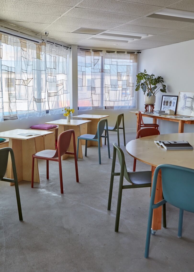
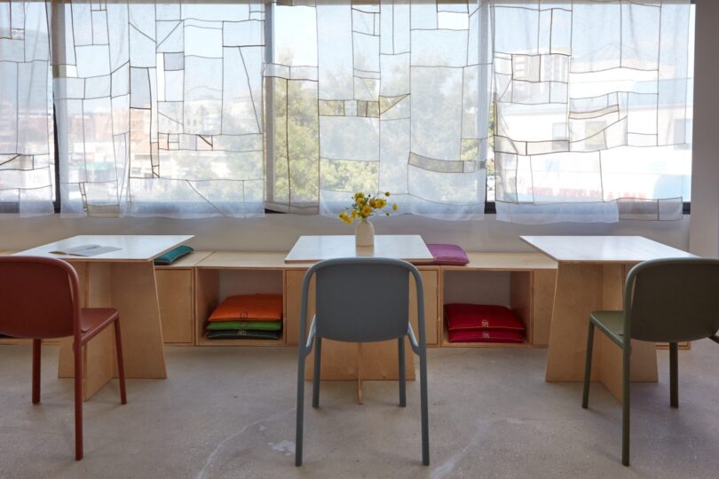
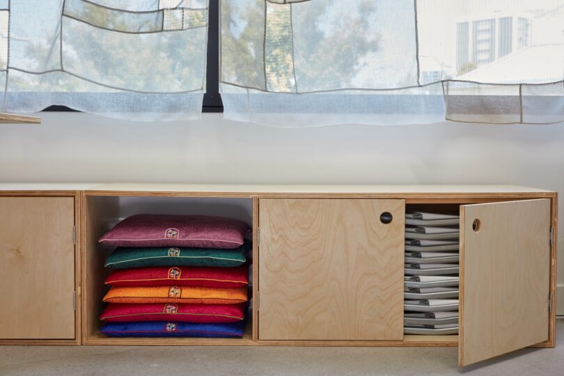
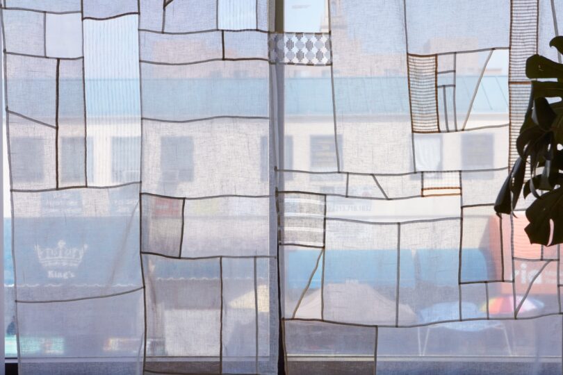
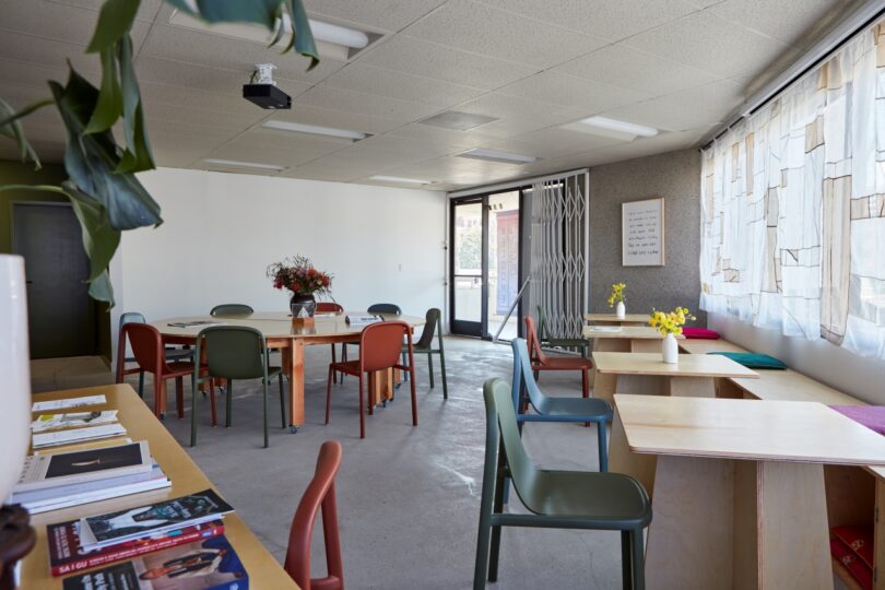
The 30-foot panoramic view of Koreatown is something that roots the community from inside out; handmade Jogakbo drapery (a traditional Korean style of patchwork) by Joann Haeun Ahn was pieced together to layer over the view. At times resembling a map, the patchwork curves, bends, and hugs the shapes of the neighboring businesses outside, and the translucent fabrics allow for the colors of Koreatown to peek through and become part of the interiors as well. The benches along the window were fabricated to mimic that of a Pyeong Sang (a traditional Korean platform or wide-rectangular bench) where people take their shoes off and sit for rest, with the added benefit of storage beneath for the stacking foldable chairs GYOPO utilizes for their many programs.


Let’s talk about furnishings! Which furniture pieces or brands did you choose to outfit the space, and why?
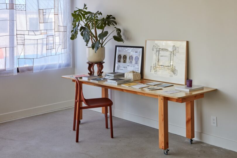
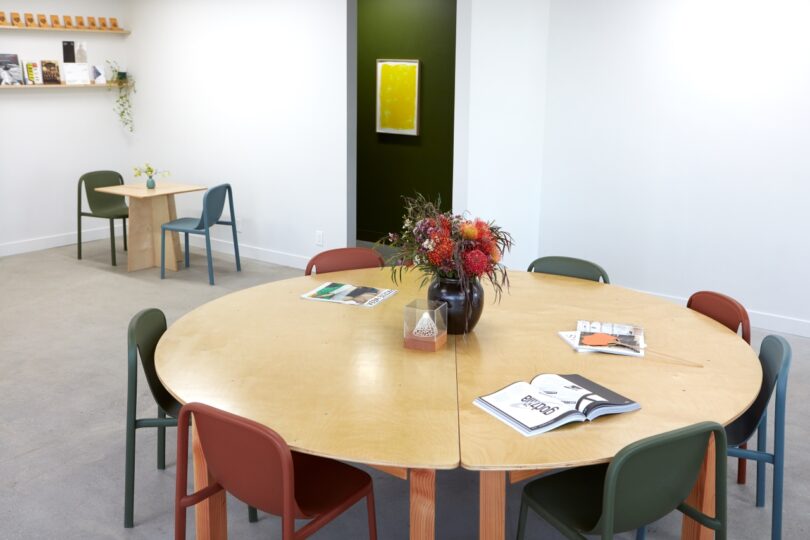
Early into the design process, a GYOPO steering committee member mentioned that her friend at Popular Architecture designed a large oval breakaway table: two half moons that flank a rectangular center table, which comes together to create a 10.5′ oval, or breaks apart to be used separately. We collectively loved the form and functionality of it, so we purchased the plans from them and had it fabricated by a local LA artisan, MM Surface Craft, who built the majority of the furnishings for this project. This table has had an enormous amount of usage in varying states: as an oval conference table for large meetings, a smaller circle for a more intimate experience, or even as a stage for performance art as Sung Neung Kyung did here.
For the small square tables, I loved the idea of having pieces that evoke the lightness and feeling of being at a cafe. These “cafe tables” can be moved around easily and allows for more privacy in the event the large oval table is being used for a meeting or presentation. We really wanted a cross base rather than the typical pedestal, but also wanted to ensure that it wouldn’t tilt easily, so we worked with MM Surface Craft to get the perfect angle for the final design and love the outcome very much! They also fabricated the wall-mounted storage benches we mentioned above, as well as the custom shelving in the niches of the kitchenette.
The chairs are from Blu Dot and are incredible indoor/outdoor designs made of 100% recycled plastic. The clients emphasized the need for stackable chairs, so we were thrilled when we saw that these not only look beautiful but also stack up to 12 at a time! We decided to select three colors to alternate so that we could infuse some playfulness and contrast into the otherwise neutral space.

Color can significantly transform drab spaces – those “before” photos really tell the story! How do you thoughtfully incorporate color in spaces like these?
Everything ultimately comes down to balance, which is definitely a characteristic of my design ethos. There always has to be an element of surprise, mystery, and even a little mischief in a space, or else it can feel bland and lifeless. We wanted the majority of the headquarters to be neutral and serene so as not to cause distractions or take away from the programming and events held, but we balanced that with the saturated green of the hallway and punchy yellow of the bathroom that introduces a different energy into the space. The multi-colored chairs also add the feeling of whimsy and lightheartedness that we felt was necessary to lighten the seriousness overall.
What are you most excited about in the upcoming year?
I’m part of the Asian American Pacific Islander Design Alliance (AAPIDA), which is an organization that engages, promotes, and empowers AANHPI folks working within the home and design industries. AAPIDA only launched about two years ago and has grown so rapidly! It’s such a beautiful experience to witness those in the interiors/architecture/build space gain more visibility and traction in the industry, something we haven’t had much of until now. We’re expanding to all the different regions of the US and I’m excited to be a part of its growth, as well as support other designers who are carving the path forward!


GYOPO’s Pacific Imaginaries program \\\ Photo by Taylor Kaltman

GYOPO’s Pacific Imaginaries program \\\ Photo by Taylor Kaltman
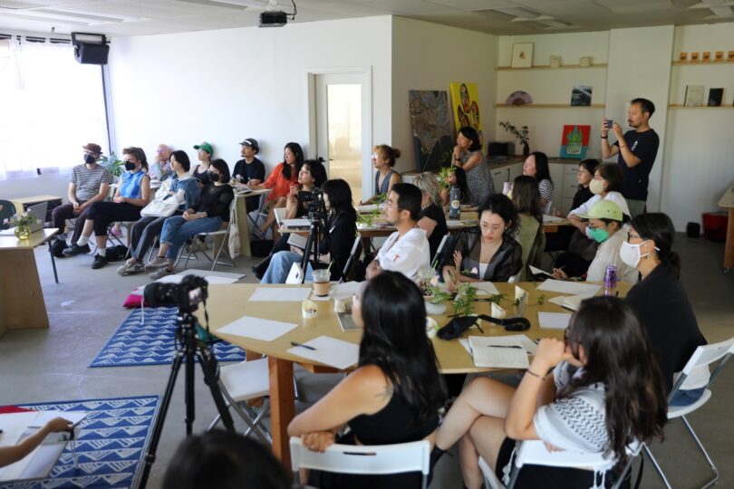
GYOPO’s Pacific Imaginaries program \\\ Photo by Taylor Kaltman
To learn more about Grace Lee-Lim’s practice, visit graceleelim.com.
General contractor: Schneider Construction & Development.
Photography by Sara Pooley unless otherwise noted.

As the Senior Contributing Editor, Vy Yang is obsessed with discovering ways to live well + with intention through design. She’s probably sharing what she finds over on Instagram stories. You can also find her at vytranyang.com.
[ad_2]